
Experiencing
a hygienic brand: Klean
Crafting a new branding experience suited to a changing world.
Being attentive to the needs of the customers and the strength of the product. Within the product lies the answer to the needs of the people, it shows its strength and its capacity to induce images.
Through reading the relevant flow of behavior, it is possible to create a forward-leaning sensible brand.
Date
2021
Role
Creative Director, 3D Artist, Designer
Delivery
Brand Strategy & Experience, Visual Vision, 3D Product Mockups, Packaging Design
OVERVIEW
New branding experience suited for the changing world by focusing on the needs of the customers & the strength of the company product.
Brand Situation
A new brand to a quickly changing world, where safety was of utmost importance.
Create a new branding experience for a mask product made in Korea. As the pandemic hit and there was a surplus of companies competing for the market. The brand needed to appeal to heavily competitive market as well as be trustworthy for the customers.
Project Overview
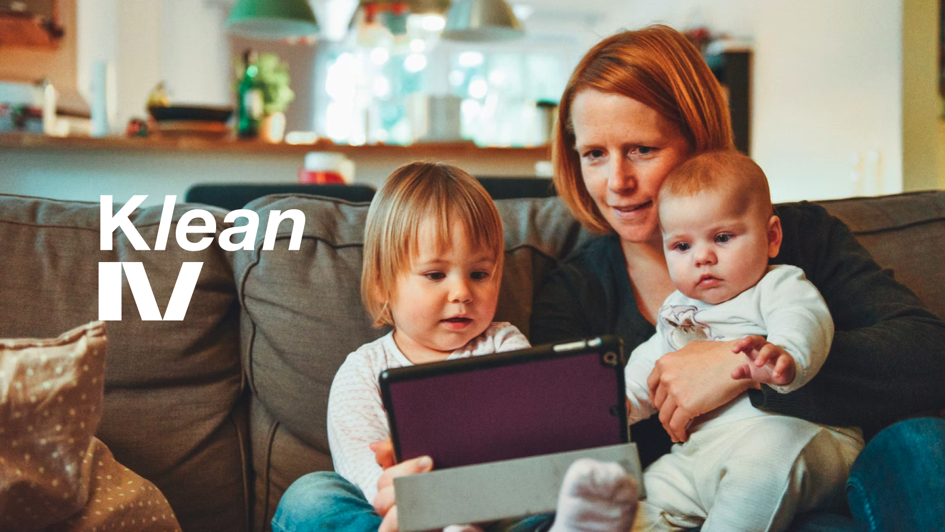
Our focus was to bring the feeling of safety and healthiness to our customers.
Our approach to the branding experience was to create a Hygienic Brand that not only relied on one product to sell, but a brand that focuses on the safety and health of the household family. Through research and the interview process my team and I were able to point the brand to potential large market portion by moving away from the what a company is selling to a brand that served a why for the customers.

PAST: EXPLORATION
What does the business stand for? How are we trying to approach our customers? We needed principles.
Brand Vision
Klean is a hygiene and health brand that strives for every family in America to have a hygienically healthy experience at home and in life.
Overarching Themes Values
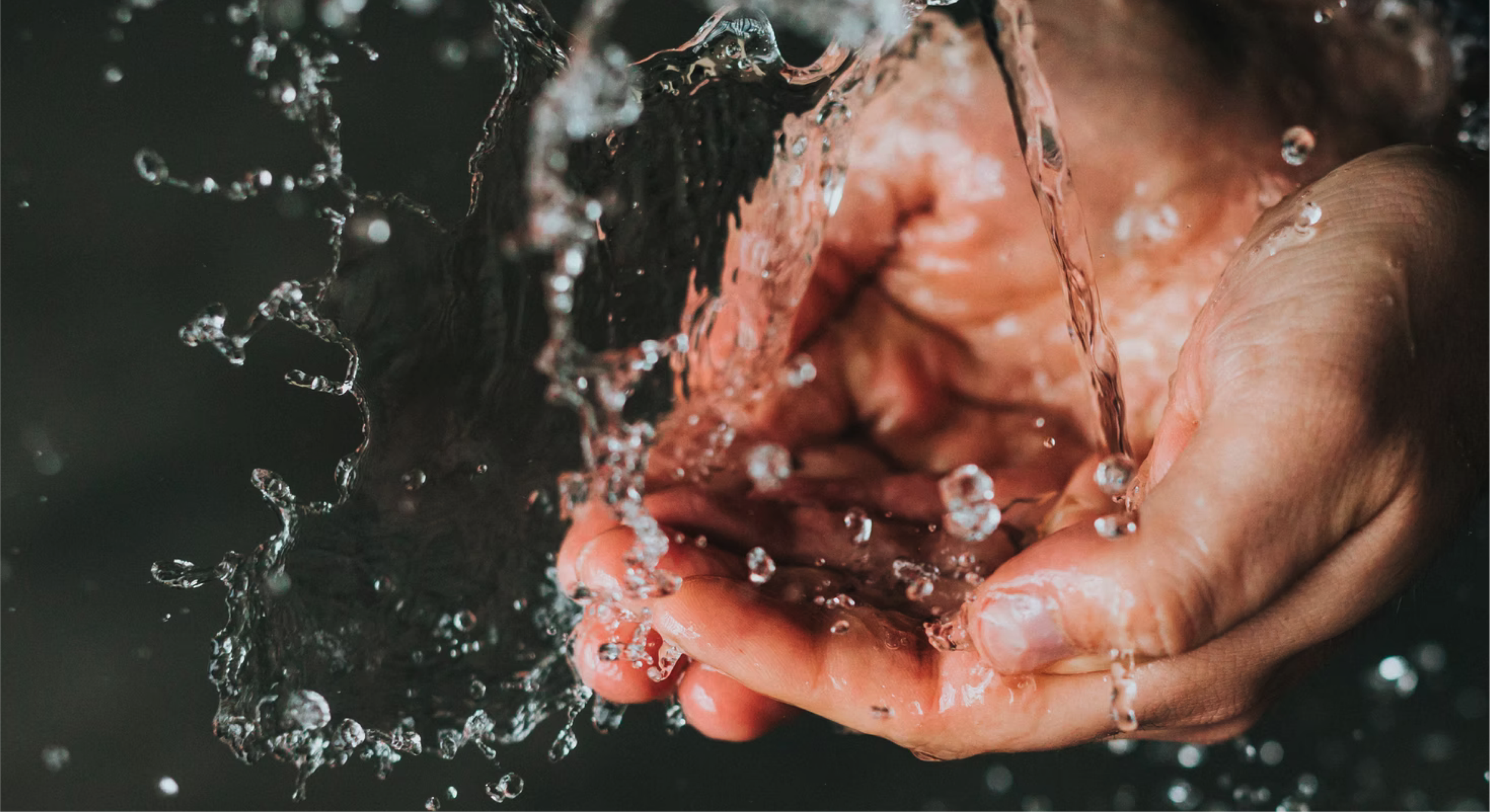
Natural ingredients and pure atmosphere
Professional Korean hygiene standards
Clean and simple sensory experience
Calming and Soothing to families
Family-first mindset to deliver the safest and best products
Keeping best healthy and safety standards reassure families to feels safe and protected
Approachable and active communication with customers
Fun and whimsical to enlighten customer hearts
Branding System Design Principles
Key Ideas
Through a series of workshops and interviews my team and I were able to bring out how the company representative and stakeholder envisioned.

Brand Vision
Klean is a hygiene and health brand that strives for every family in America to have a hygienically healthy experience at home and in life.
Tagline
At Klean, we’re passionate about helping to keep your family safe and healthy.
Brand Archetype
Caregiver - “Everyone deserves care and we must all strive to bestow service upon one another.”

PRESENT: BRAND IDENTITY SYSTEM
Applying the foundational principles to the visual language system.
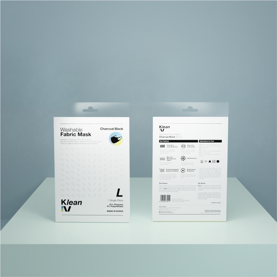
LOGO DESIGN
The ‘K’ represents the cleanliness and hygienically safe standards of Korea.
Klean wants to be a brand where customers can ‘LEAN’ on, to keep customers’ families safe & healthy.
DESIGN SHAPES
The three quadrilateral shapes below are a motif for columns. The shape itself derives from the lower half of ‘Kl’. Columns are structures that uphold grandiose buildings. Here the essence of the column shape signifies the supporting four core values Klean adheres to: Natural+Pure; Hygienic+Safety; Family+Caring; Whimsical+Calming. It also symbolizes the brand itself striving to be dependable columns for families to lean on for hygiene products to keep them safe and healthy.
The logotype is simple and approachable. ‘Helvetica Neue’ is familiar yet slightly different to be provoking. The color format is simple charcoal black to be bold yet still soft enough to be embracing. The gradient colors represent the four core values joined together.
LOGO DESIGN ROOTS
Typography
Brand Color System


Graphic Motif
Designs are systematic and minimal throughout the brand with repeated motifs and the usage of negative space. Systematic design layouts throughout the brand represent the proven hygienic standards of Korea. Alongside the mixed-use of minimalistic graphic representations in negative space will give customers reassurance of the quality of the brand and emphasize hygienically clean feelings. Quadrilateral shapes and lines are systematically and minimally used to emphasize this design principle.
FUTURE: USE-CASE SCENARIOS
Visualizing use-case scenarios as a base for development and embracing the future.
Applications


CONCLUSION