CLD #01 PRDs, user flow, function specifications with Manyfast & Claude
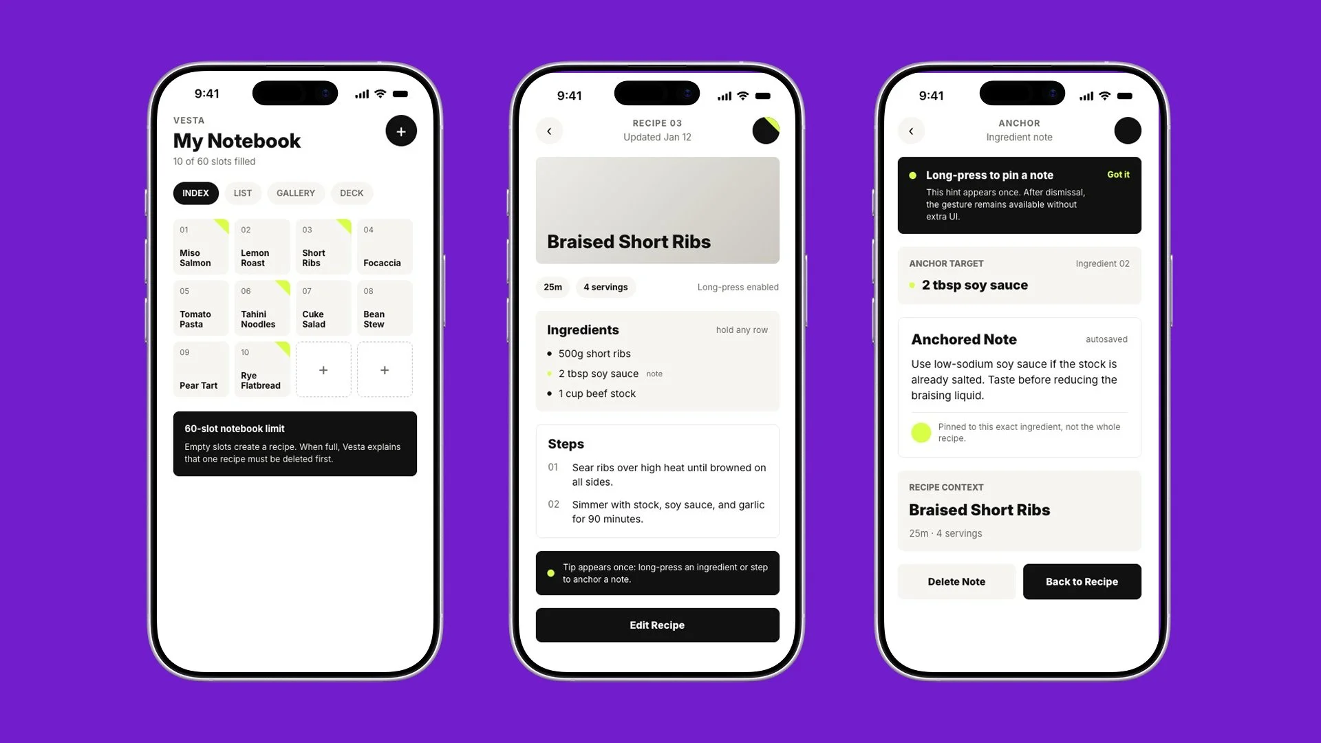
Last time, I started a recipe manager as an exercise that turned into a prototype after a few iterations. However, I felt I was relying on Claude for doing most of the planning. The other part was after validating the app, I wasn’t sure about the next direction. It didn’t feel right to publish a project I hardly knew except for the idea. So I started to look into methods of building an app and stumbled on Manyfast.
Manyfast introduces themselves as an AI product manager that helps from PRD to wireframe. You write a prompt of what you want and it creates not only a product roadmap, but also the functional specification document and a user flow diagram helping pin down the app from abstract to concrete. I’m assuming these documents are highly sought out for waterfall-based project management.
I take it that many Korean and Japanese corporations are highly specialized in bottom-up approaches. One of the reasons may be Kaizen, a management philosophy that improves parts of the business gradually through continuous refinement and incremental change, rather than large-scale transformations.
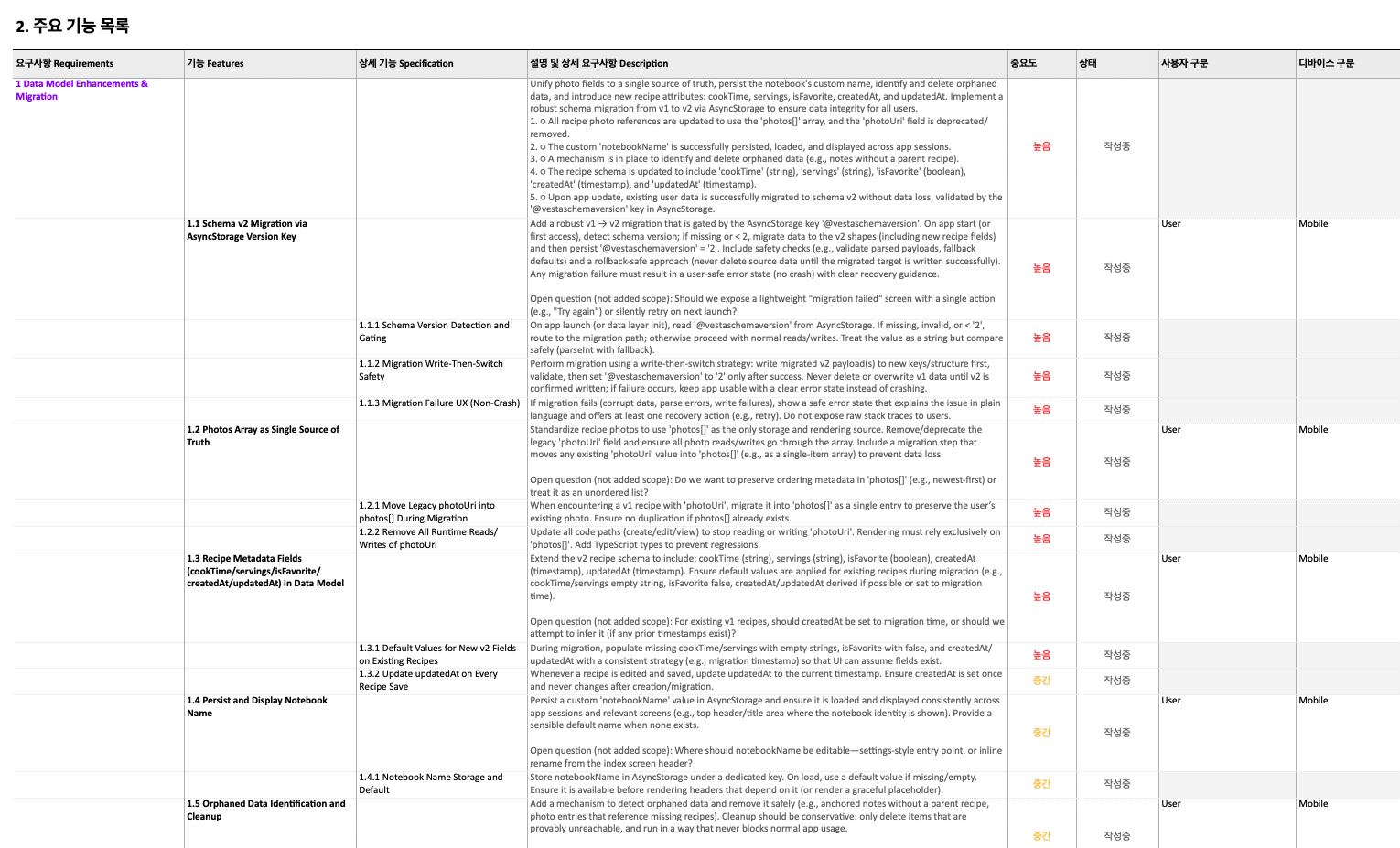
So with the many context already built in Claude, I started with a prompt and got an initial set of functional specifications. Though I had to go through them one by one and update them along the way, they were very helpful in understanding the structure of the app being built.
Another useful part of Manyfast was its ability to create wireframes from the functional specifications. The wireframes are the bare bones of the app, visualizing only the functions outlined in the document. This not only helps visualize what’s needed, but also serves as a source of inspiration. Not in the sense of inspiring a design layout, but rather helping me understand what each screen is trying to represent.
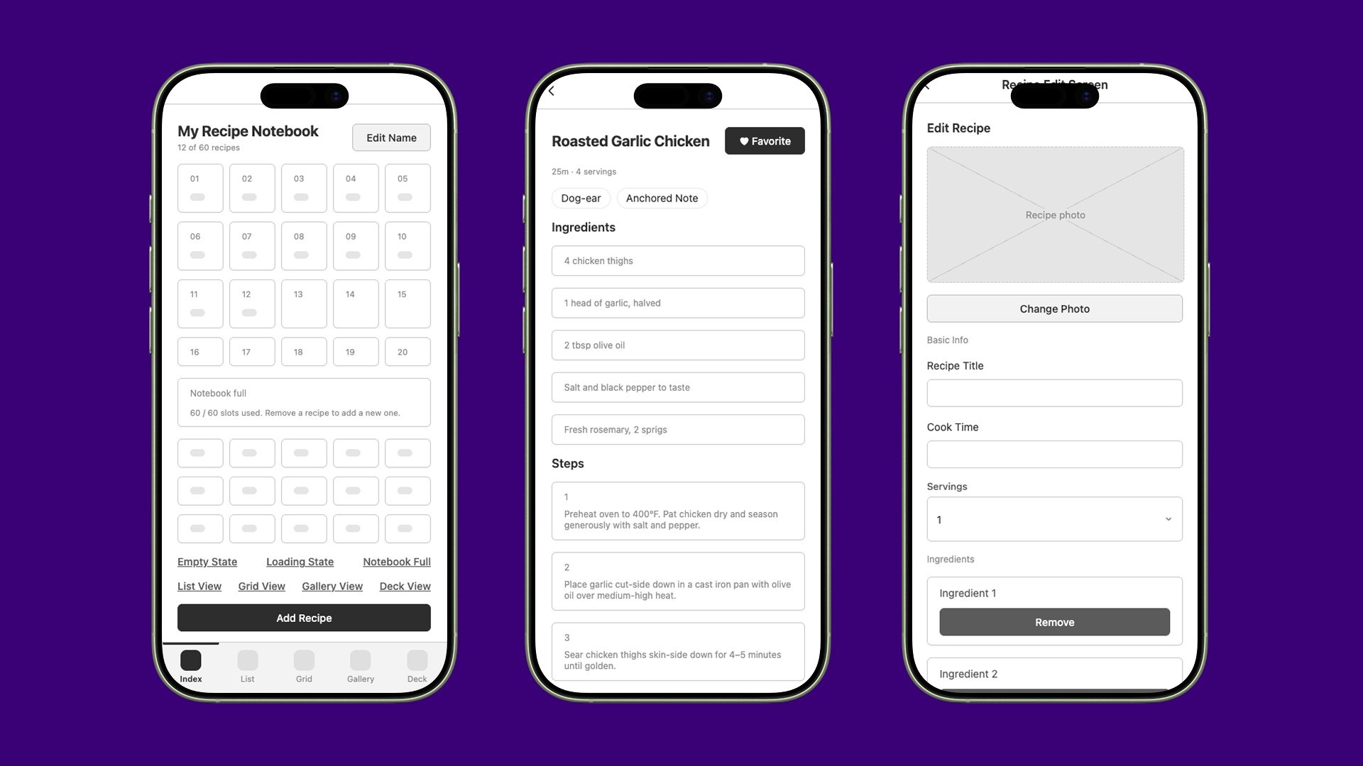
Sometimes the wireframes contain too much information, but they are not suppose to be a guideline of what must appear on a screen. Instead, they serve as a guide to the functional experience users are supposed to have. With the freedom of design, I can recombine parts of the functional wireframe into entirely different screens, while still keeping everything unified under a coherent user flow.
At times, when working with a top-down design approach, it is difficult to grasp the underlying functionality and flow because inspiration comes from many directions. Only after building enough do we get to decide, “Ah, this is what I wanted,” which feels rather inefficient in hindsight.
Not only do we gain greater clarity about the build, but the AI also develops a better understanding of the project, leading to stronger teamwork because both the AI and I are aligned on what we are building. If previous app instantiations felt like a client-to-agency relationship, this new method of building from the ground up feels much more like a collaboration, rather than waiting on a freelancer to finish a project.
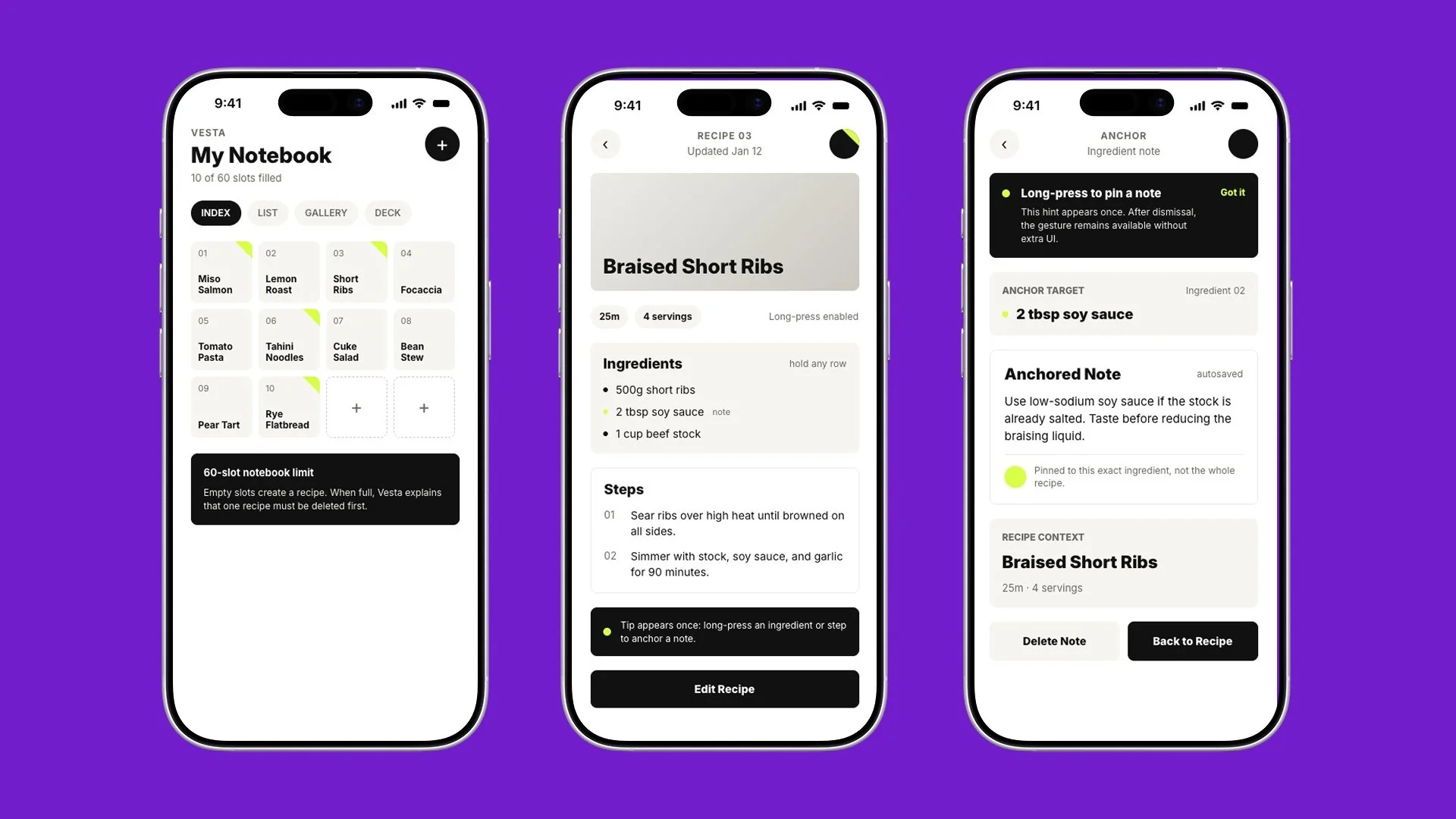
Here the last image shows a more cohesive UI design based on the documents and user flows. While it might look simple, it is easier to grasp because each screen is setup to a specific experience it’s catering to. From here on out we are able to start exploring creatively within the limits. Even more so the AI has more power to be creative within these limitations and able to add more experimental solutions because the goal is clear not only in the sense of a vision, but also within each pocket of experience within the screen. In the end we were able to structure out 30 screens to be designed for a closed looped system for this app.
Originally posted on LinkedIn